CORPORATE BRANDING
A series of corporate logos and the concepts behind them.
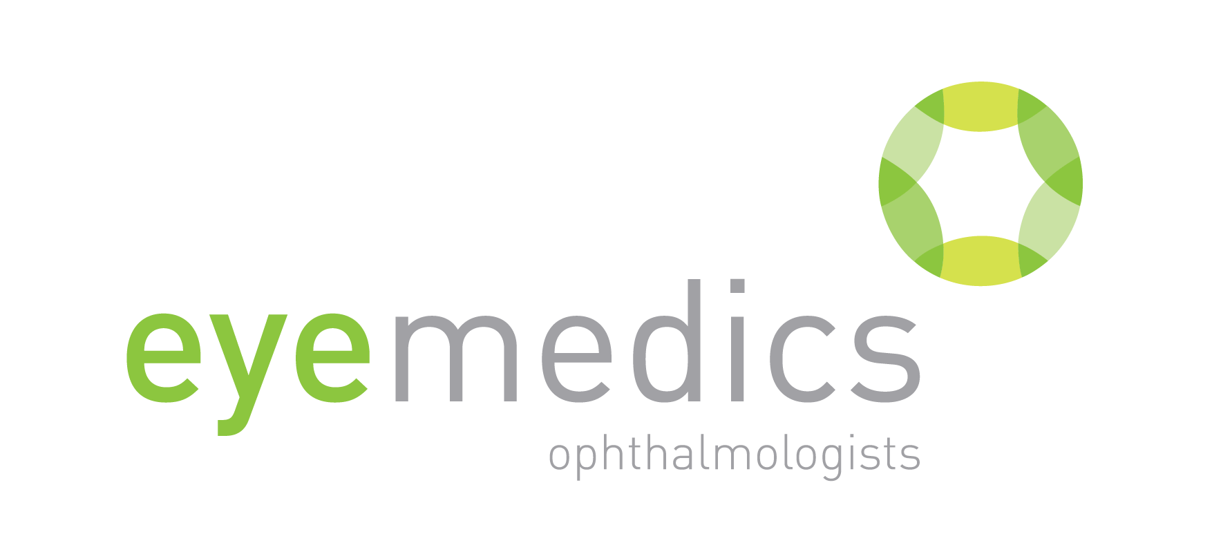
EYEMEDICS
Identity created for Eyemedics Opthalmologists, a medical
practice where six doctors specialise in eye treatment and care.
practice where six doctors specialise in eye treatment and care.
When designing this logo the main focus was to demonstrate
the link between ophthalmologists and eyes without being
overtly obvious. The icon was created to represent the form of
the lens and pupil. This form is made up of segments which
themselves are eye-like in shape.
the link between ophthalmologists and eyes without being
overtly obvious. The icon was created to represent the form of
the lens and pupil. This form is made up of segments which
themselves are eye-like in shape.
When these segments come together they develop an
aperture-like quality with an opening within the centre.
This opening suggests going beyond the eye to the brain
and visual pathways that ophthalmologists also treat.
aperture-like quality with an opening within the centre.
This opening suggests going beyond the eye to the brain
and visual pathways that ophthalmologists also treat.
The circle form of this identity, whilst clean and professional, is
unthreatening and welcoming to patients. The segments that
come together to create the circle also visually represent the six
ophthalmologists that come together to form Eyemedics.
Green gives a sense of health and vibrancy and, when combined
with the grey and sans serif typeface, gives the identity a
modern appeal with a focus on quality care and service.
Logo Design
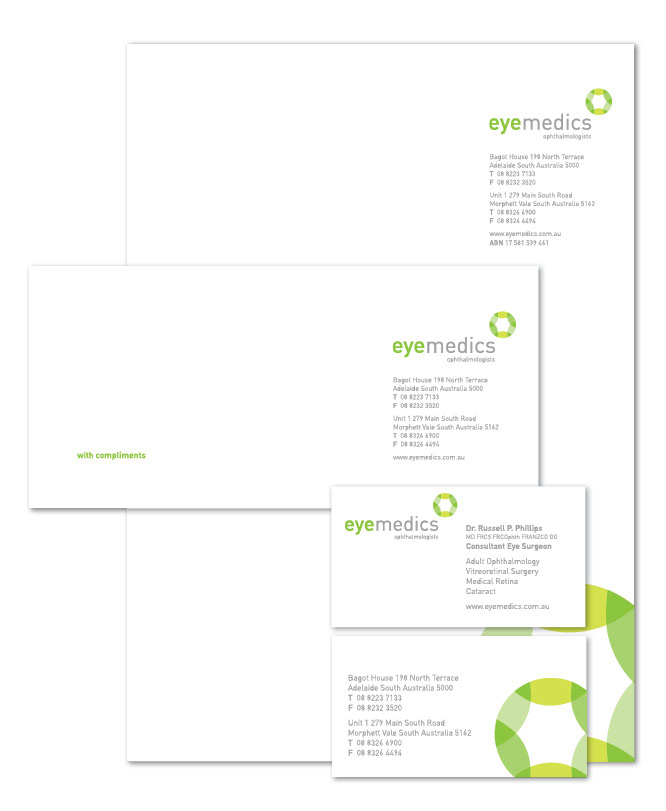
Stationery Design
TAYLORED CONSTRUCTION
Identity created for Taylored Construction, a boutique
construction business.
construction business.
This logo was designed to portray the modern and
sophisticated home designs created by Taylored Construction
while still being friendly and approachable. This was done by using
clean lines, capital letters and contemporary greys combined with
warm orange. Typographic elements that relate back to the family
background of the business continue the small business story.
This is done through the business name and icon. The name relates
to the last name of the director, Taylor, being spelt Taylored vs Tailored.
The icon displays construction-like forms through the letters T and C.
These letters stand for the initials of both the company name and the
husband and wife team behind the business, Tom and Colleen.
to the last name of the director, Taylor, being spelt Taylored vs Tailored.
The icon displays construction-like forms through the letters T and C.
These letters stand for the initials of both the company name and the
husband and wife team behind the business, Tom and Colleen.
This typographic treatment has been further extended to be used as a
secondary icon for the business. Encapsulated by a circle, this element
can be used for branding on uniforms, company cards and signage.
secondary icon for the business. Encapsulated by a circle, this element
can be used for branding on uniforms, company cards and signage.
Logo Design
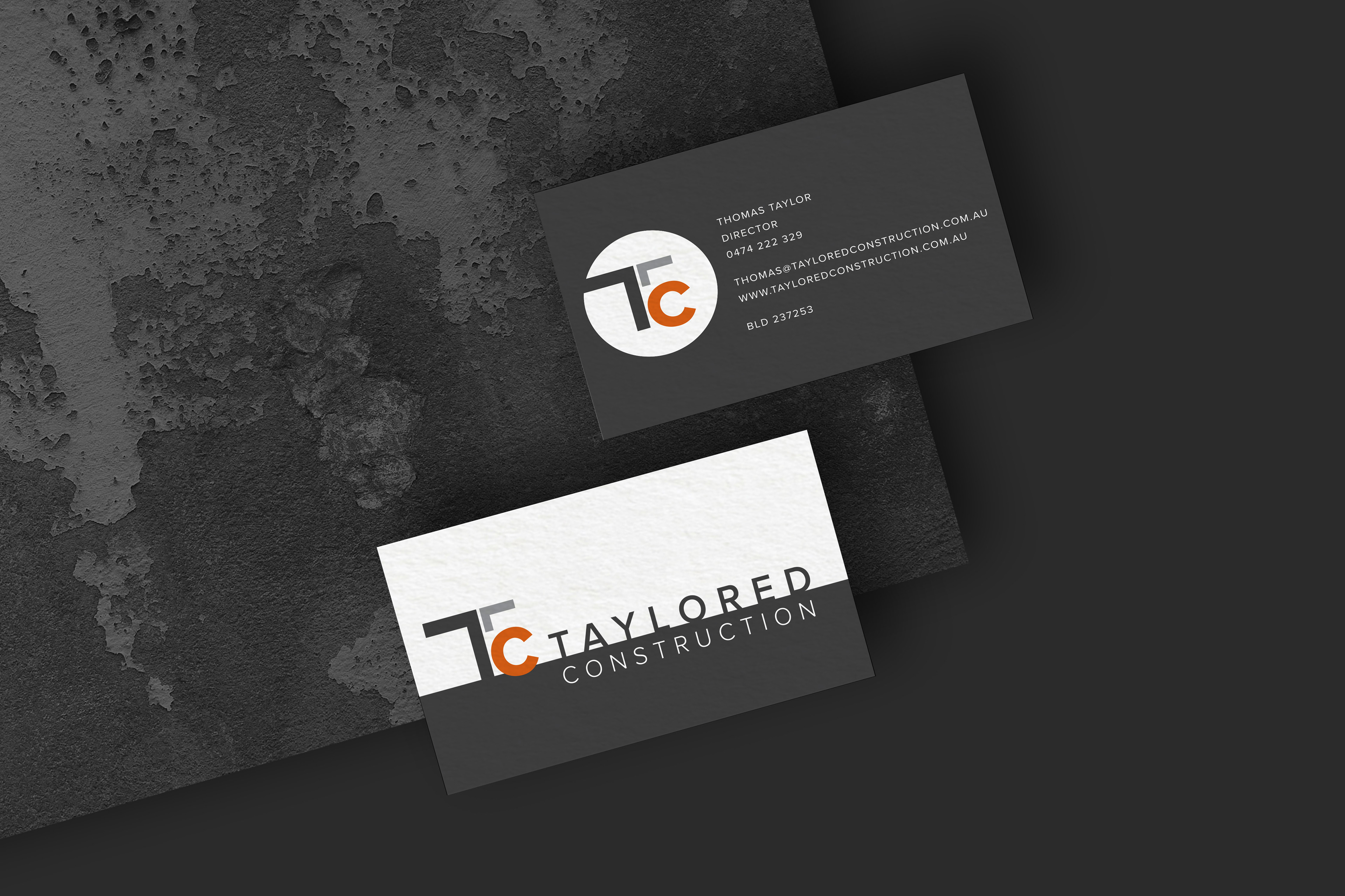
Stationery Design
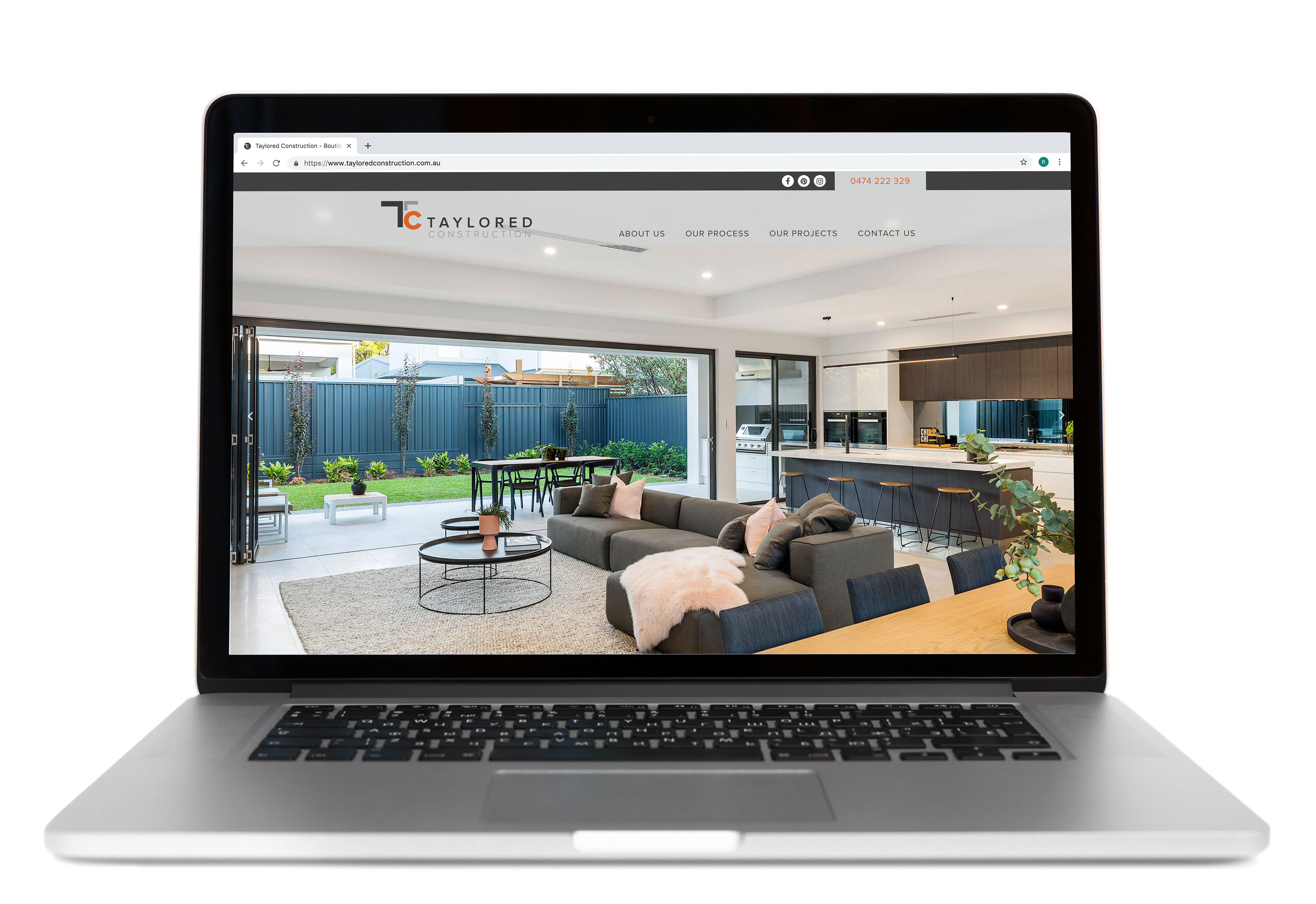
Website Design
BALNAVES
Identity created for Balnaves Carpentry. Depicting hand-made
quality with a contemporary edge, this logo was inspired by wood,
the main element used in carpentry.
quality with a contemporary edge, this logo was inspired by wood,
the main element used in carpentry.

Logo Design
STEADFAST
A corporate design with contemporary appeal, this logo takes
inspiration from Steadfast being a business centre. The idea of
different businesses with separate entities coming together to work
from the same location is integral to this concept and is shown
through the graphic element of the logo.
This graphic element, through simple geographic forms, represents
four different people (or businesses) coming together to make a
four walled space eluding to the idea of an office. It can also be seen
as four people working at their desks. Their forms create a central
location maintaining the idea of a business centre.
To maintain approachability and reflect open communication,
the square has been tilted off the type and there is a free flow of
negative space throughout the form. Using the circular forms to depict
the element of people (or heads) within this graphic also gives the
corporate logo a personable feel.
the square has been tilted off the type and there is a free flow of
negative space throughout the form. Using the circular forms to depict
the element of people (or heads) within this graphic also gives the
corporate logo a personable feel.
The typography used was chosen to complement this
modern graphic form. It’s rounded letters reflect the curves within
the icon and maintains a contemporary feel. The colours used are
a corporate navy blue, to clearly identify the idea of business,
balanced with an orange to maintain warmth.
Logo Design

Stationery Design
APG
Identity created for Australian Prestige Gardens. Their services
include turf, paving, construction, irrigation and general landscaping.
include turf, paving, construction, irrigation and general landscaping.
This logo was created from the abbreviation of the business name.
Simple and contemporary, the letter forms were designed to take on a
structural appearance representative of the construction work APG does.
Simple and contemporary, the letter forms were designed to take on a
structural appearance representative of the construction work APG does.
The leaf forms and tones of green soften these letter forms and relate
the business back to nature. The leaf forms grow from the type and
become a focal feature of the identity, carried across other
mediums such as a flyer.
the business back to nature. The leaf forms grow from the type and
become a focal feature of the identity, carried across other
mediums such as a flyer.
This logo was designed to represent Australian Prestige Garden’s
focus on a ‘complete outdoor lifestyle’.
focus on a ‘complete outdoor lifestyle’.
Logo Design
JACQUI LEOPARDI CELEBRANT
The idea behind this logo was to really portray the connection that the celebrant,
Jacqui, has with the couples she is marrying and the journey she is taking with them,
learning their story of love. This is conveyed through the abstract hearts, that are symbolic
of a connected ribbon or path. The three hearts also represent the celebrant and the
couple standing together.
Jacqui, has with the couples she is marrying and the journey she is taking with them,
learning their story of love. This is conveyed through the abstract hearts, that are symbolic
of a connected ribbon or path. The three hearts also represent the celebrant and the
couple standing together.
A watercolour texture was added to these hearts to give depth to the symbol and,
within its softness, portray a calm and relaxed feeling which is how Jacqui wants her
couples to feel on their wedding day. Having the watercolour contained within the
structure of the heart forms in addition to the modern typography, keeps the logo
clean and professional.
Logo Design
RENTWELL PROPOSAL
Role out of already established Rentwell branding to 25pp prospectus document
using elements of branding to create dynamic layouts and infographics within the
brochure to reinforce the company voice and appearance.
using elements of branding to create dynamic layouts and infographics within the
brochure to reinforce the company voice and appearance.
